


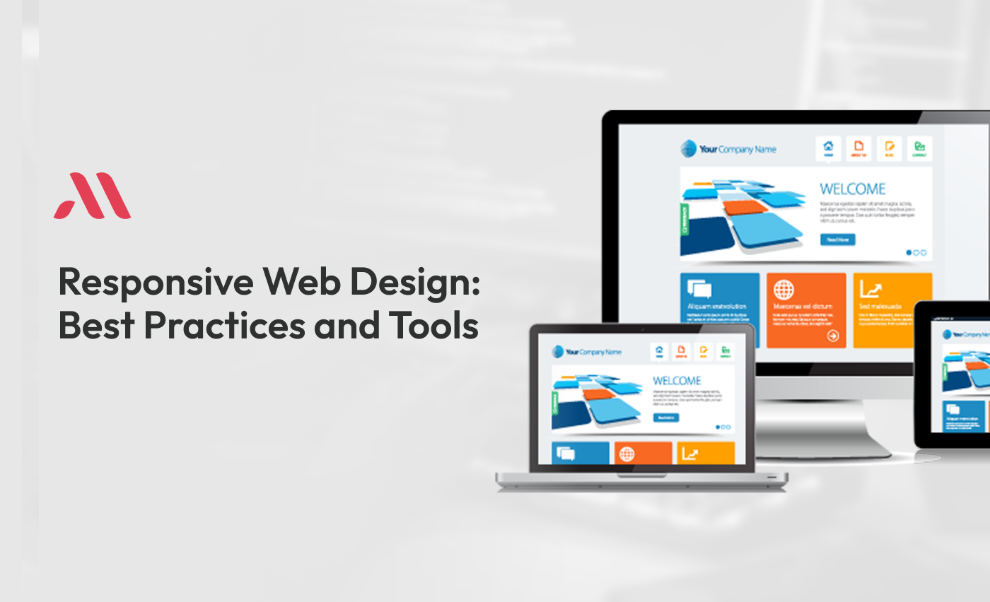
What is Responsive Web Design?
Responsive Web Design is a way to make websites look good on any device. Whether you're using a big desktop computer, a tablet, or a small mobile phone, a responsive website will adjust its layout to fit the screen perfectly.
This means no more zooming in and out or scrolling side to side to read the content. The website will automatically resize, hide, shrink, or enlarge, making it easy to use on any device.
Why is Responsive Web Design Important?
Responsive Web Design is very important because people use many different devices to browse the internet. If a website looks good only on a computer, but not on a mobile phone, people may not use it.
By using Responsive Web Design, you can make sure your website works well on all devices, keeping your visitors happy.
Key Elements of Responsive Web Design
1. Flexible Layouts
Flexible layouts use a grid system to arrange content. As opposed to using fixed widths, which can look strange on smaller screens, flexible layouts use percentages to make sure everything fits perfectly, no matter the screen size.
2. Flexible Images and Media
Images and videos should be resized to fit the screen. This can be done using CSS (Cascading Style Sheets), which we will talk about more later. A common way to do this is by setting the maximum width of images and videos to 100%. This way, they will never be wider than the screen.
3. Media Queries
Media queries in CSS are used to apply different styles for different devices. For example, you might want a larger font size on a small screen to make the text easier to read. Media queries let you set specific rules for different screen sizes, making your website truly responsive.
Best Practices for Responsive Web Design
1. Start with a Mobile-First Approach
Starting with a mobile-first approach means designing your website for mobile devices first, then making adjustments for larger screens. This helps ensure that your website will work well on small screens, which are usually more challenging to design for.
2. Use Responsive Web Design Breakpoints
Breakpoints are the points where your website layout changes to fit different screen sizes. Common breakpoints in Responsive Web Design include:
- 320px for small mobile devices
- 480px for larger mobile devices
- 768px for tablets
- 1024px for laptops
- 1200px and above for large screens
By setting breakpoints, you can adjust the layout and content to fit perfectly on any device.
3. Optimize Images and Media
Large images and videos can slow down your website, especially on mobile devices with slower internet connections. Use tools to compress images and videos without losing quality. This helps your website load faster and provides a better user experience.
4. Use Fluid Grid Layouts
A fluid grid layout means that elements on your website resize proportionally. As opposed to using fixed sizes, use percentages or flexible units like ems and rems. This ensures that your layout adapts smoothly to different screen sizes.
5. Test on Real Devices
Testing on real devices is important. Emulators and simulators can help, but they might not show how your website performs on actual devices. Make sure to test on various devices and browsers to ensure your website looks and works great everywhere.
6. Use Scalable Vector Graphics (SVG)
SVGs are a great alternative to traditional image formats like PNG or JPEG. SVGs are scalable, meaning they look sharp and clear at any size, without losing quality. This makes them perfect for logos, icons, and other graphics that need to look good on all devices.
7. Implement Responsive Typography
Typography also should be responsive. Use relative units like ems or rems as opposed to fixed units like pixels. This way, your text will scale appropriately on different screen sizes. You can also adjust font sizes using media queries to improve readability on smaller screens.
8. Prioritize Content
On smaller screens, it’s important to prioritize content. Show the most important information first and consider hiding less important content. This ensures users get the important information without having to scroll through a lot of unnecessary content.
9. Simplify Navigation
Navigation menus can be tricky on small screens. Use a simple, easy-to-use navigation menu, like a hamburger menu, which can expand when clicked. This keeps the navigation compact and accessible.
10. Touch-Friendly Design
Design your website to be touch-friendly. Ensure buttons and links are large enough to be tapped easily, with enough spacing around them to avoid accidental clicks. This improves the user experience on touch devices like smartphones and tablets.
Tools for Responsive Web Design
1. CSS (Cascading Style Sheets)
CSS is the language used to style websites. With CSS, you can control the layout, colors, fonts, and much more. For Responsive Web Design in CSS, media queries are important.
2. Bootstrap
Bootstrap is a popular framework for building responsive websites quickly. It comes with a grid system, pre-designed components, and utilities that make it easy to create responsive layouts.
3. Flexbox
Flexbox is a CSS layout module that makes it easier to design flexible and responsive layouts. It can be used to align items and distribute space within a container.
4. Grid Layout
CSS Grid Layout is another powerful tool for creating detailed, responsive layouts. It helps you to divide your page into rows and columns, and place content in specific areas.
5. Adobe XD
Adobe XD is a powerful design tool for creating wireframes, prototypes, and designs for websites and mobile apps. It helps you to create responsive designs and see how they will look on different devices.
6. Figma
Figma is a cloud-based design tool that helps with real-time collaboration. It’s great for designing responsive layouts and prototypes, and you can share your designs with others for feedback.
Common Challenges in Responsive Web Design
1. Browser Compatibility
Ensuring that your website looks and works the same across different browsers can be challenging. Use cross-browser testing tools to check how your website performs on various browsers and make necessary adjustments.
2. Performance Optimization
Responsive websites should load quickly on all devices. Optimize images, minify CSS and JavaScript files, and use a content delivery network (CDN) to improve loading times. Slow websites can frustrate users and cause higher bounce rates.
3. Maintaining Consistency
Maintaining a consistent look and feel across different devices can be challenging. Use a style guide or design system to ensure that your website’s design remains consistent, no matter the screen size.
4. Handling Advanced Layouts
Advanced layouts can be difficult to make responsive. Break down your layout into smaller, manageable sections, and use flexible grids and media queries to adjust the layout for different screen sizes.
5. Testing Responsiveness
Regularly test your website’s responsiveness. Use tools like Google Chrome’s DevTools, which helps you to simulate different devices and screen sizes. This helps you identify and fix any issues before they affect your users.
Real-Life Examples of Responsive Web Design
1. Airbnb
Airbnb’s website is a great example of responsive web design. The layout adjusts easily across different devices, providing a consistent and user-friendly experience. The images and content resize dynamically, ensuring a smooth browsing experience.
2. Starbucks
Starbucks’ website also demonstrates excellent responsive web design. The navigation menu changes to a hamburger menu on smaller screens, and the content rearranges itself to fit perfectly. This makes it easy for users to browse and order coffee from any device.
3. Apple
Apple’s website is known for its sleek, responsive design. The site adjusts beautifully to different screen sizes, providing an optimal viewing experience. The use of high-quality images and smooth animations adds to the overall user experience.
4. The Guardian
The Guardian’s news website is another great example of responsive design. The layout changes to Make changes to different screen sizes, ensuring that articles are easy to read on both desktops and mobile devices. The website also prioritizes content, making sure the most important news is visible first.
Final statement
Responsive Web Design is important for creating websites that work well on all devices. By following best practices and using the right tools, you can ensure your website looks great and provides a good user experience, no matter what device your visitors are using. Remember to use flexible layouts, optimize images, set responsive web design breakpoints, and test on real devices. With these tips, you'll be well on your way to getting mastery of Responsive Web Design.
By understanding and applying Responsive Web Design principles, you can create websites that are accessible, user-friendly, and look good on any device. This not only improves user satisfaction but also helps your website rank better in search engines, because of the improved usability and performance.
For excellent web and mobile app development services, Choose MicraSol - App Development Company. Get cutting-edge solutions customized to your needs. Contact MicraSol - App development company right now!
FAQS
1. Why is Responsive Web Design important?
Responsive Web Design is important because people use various devices to access the internet. A responsive website ensures that all users, no matter the device they are using, have a positive and easy experience. This can lead to higher user engagement and satisfaction.
2. What are the key elements of Responsive Web Design?
The key elements of Responsive Web Design include flexible layouts, flexible images and media, and media queries. These elements work together to make sure the website adjusts its layout and content to fit different screen sizes.
3. How do flexible layouts work in Responsive Web Design?
Flexible layouts use a grid system and percentages instead of fixed widths. This helps the layout to resize smoothly across different screen sizes, ensuring that content fits perfectly no matter the device.
4. What are media queries in CSS?
Media queries in CSS are used to apply different styles for different devices based on their screen size, resolution, or other characteristics. They help make websites responsive by allowing designers to create styles that adjust to various screen sizes.
5. What are Responsive Web Design breakpoints?
Breakpoints are specific points in the CSS where the layout changes to fit different screen sizes. Common breakpoints include 320px for small mobile devices, 480px for larger mobile devices, 768px for tablets, 1024px for laptops, and 1200px and above for large screens.